Moments of Life is now LifeSG – the story so far
Last month, we launched LifeSG – an upgraded, rebranded and enhanced version of the app formerly known as Moments of Life. At GovTech, we’re big believers of journaling, so instead of just sharing with you all the new features (they are plenty!), we thought we would also write about the process and the lessons we learned along the way.
LifeSG was first conceived for newborns
Every app has an origin story, and LifeSG’s started somewhat poetically for people just starting their life – newborn babies and their parents.
The idea was simple. New parents find it stressful because there’s a lot of paperwork to be done when a baby enters the world. The first version of our app aimed to help by providing information about birth registration, immunisation records, and it has also helped simplify the entire process from birth registration to Baby Bonus application by cutting down the time user typically need to spend (from 60 minutes to 15 minutes!).
Now, we don’t want to brag, but since its inception in 2018, seven in 10 Singaporean births have been registered using this app – a fact that we’re very proud of!
That said, we knew the demand for government digital services wasn’t going to stop there. After all, newborns and their parents were just one segment of our diverse population.
How could we provide the same level of utility and accessibility to everyone else?
Having one consolidated app wasn’t always on our minds
In the planning stage, we considered having multiple applications for different segments of the population – one for seniors, one for working adults, one for parents.
This approach had several advantages – individual apps are faster to develop, and simpler to design – but we soon came to realise a citizen often wears many hats.
For example: A user can be a father, a vehicle owner, working a 9-5 job, as well as a volunteer on weekends.
That means if we went down the route of individual apps, they would have to download 6 to 10 different applications just to transact with the government.
As of May 2019, there were some 170 affiliated government apps available – an impressive array of services, no doubt – but once you take into consideration the differences in learning curve, hassle of using multiple apps and the cost of maintaining these apps, the cons really started to add up.
Even if they didn’t use apps, having to navigate across multiple websites and services can lead to citizens getting lost, frustrated or being bombarded with information they can’t process.
That’s why we created LifeSG to make life easier
The thinking behind LifeSG is simple: the less time citizens spend transacting with the government, the more time they get to focus on the things they love.
To make that a reality, we’ve created one app with one user interface, one simplified user experience, across all multiple government services – learning to use the app will be easy and actually using it will be even easier.
Of course, being simple to use is not enough reason for someone to use an app. To that end, we’ve focused on two things.
1. Relevance through Curation
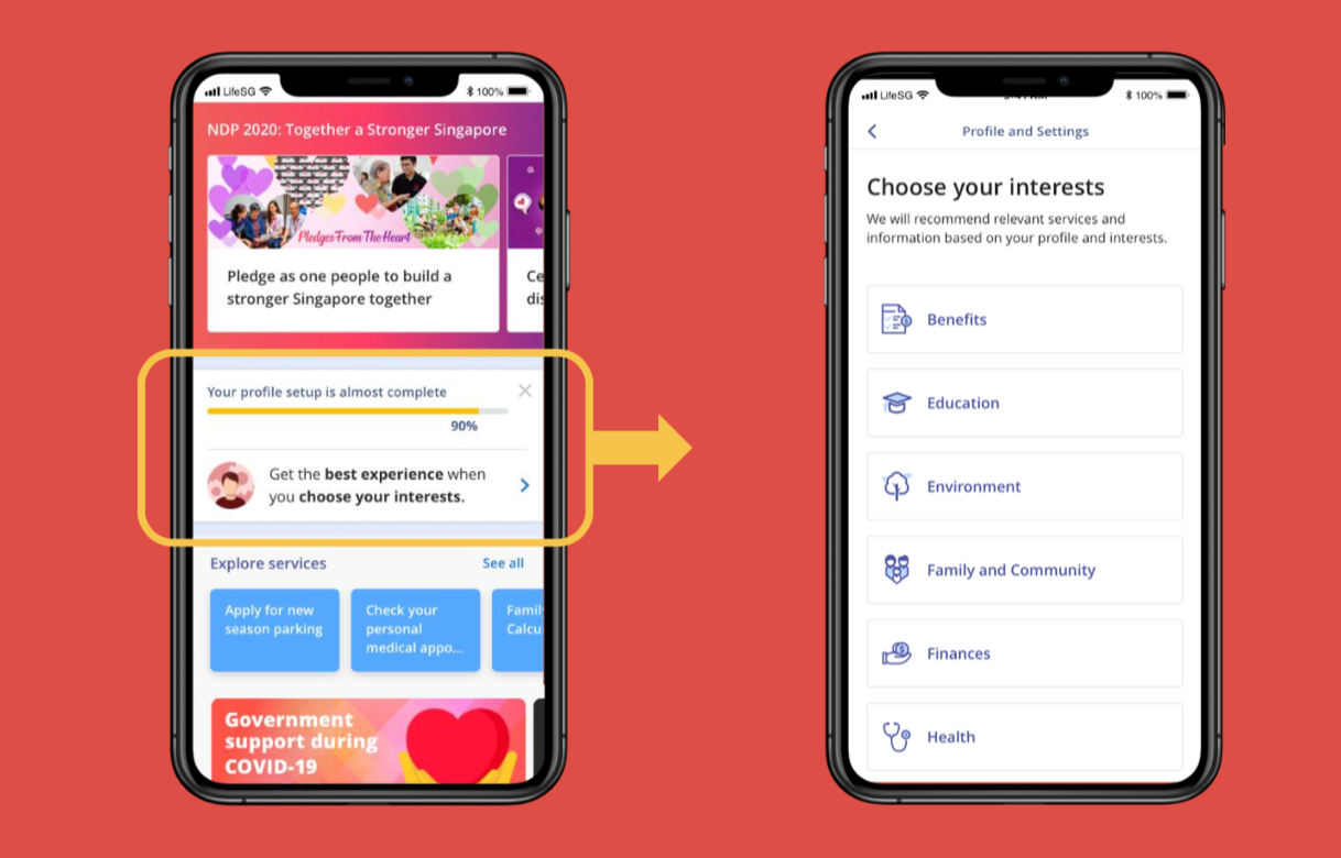
 Based on their selection and profile, the app will push out relevant information on LifeSG to citizens.
Citizens are busy people with limited time and attention. They are also an incredibly diverse group of people, each with different needs.
To stay in their hearts and the coveted position on their phones, we built the app around their individual needs so they’ll find it relevant and useful to them.
To make this happen, we’ve created a recommendation engine that pushes relevant information based on their profile and selected interests.

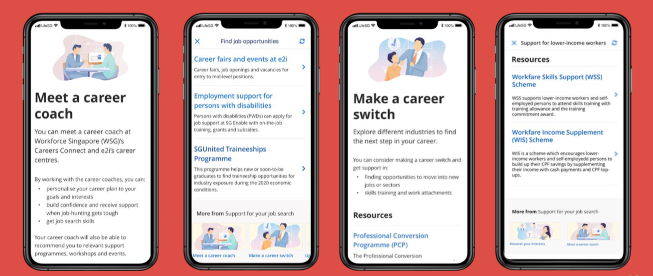
For example, a working adult will receive information about employment support to find out how they can go about making a career switch, or even make arrangements to meet a career coach. If they are also a parent with a young child, they will also get info about the annual MOE Primary 1 registration exercise when it is available.
You get the idea.
2. One app, over 40 services
 40+ services in one app! Trust us, this wasn’t easy to pull off.
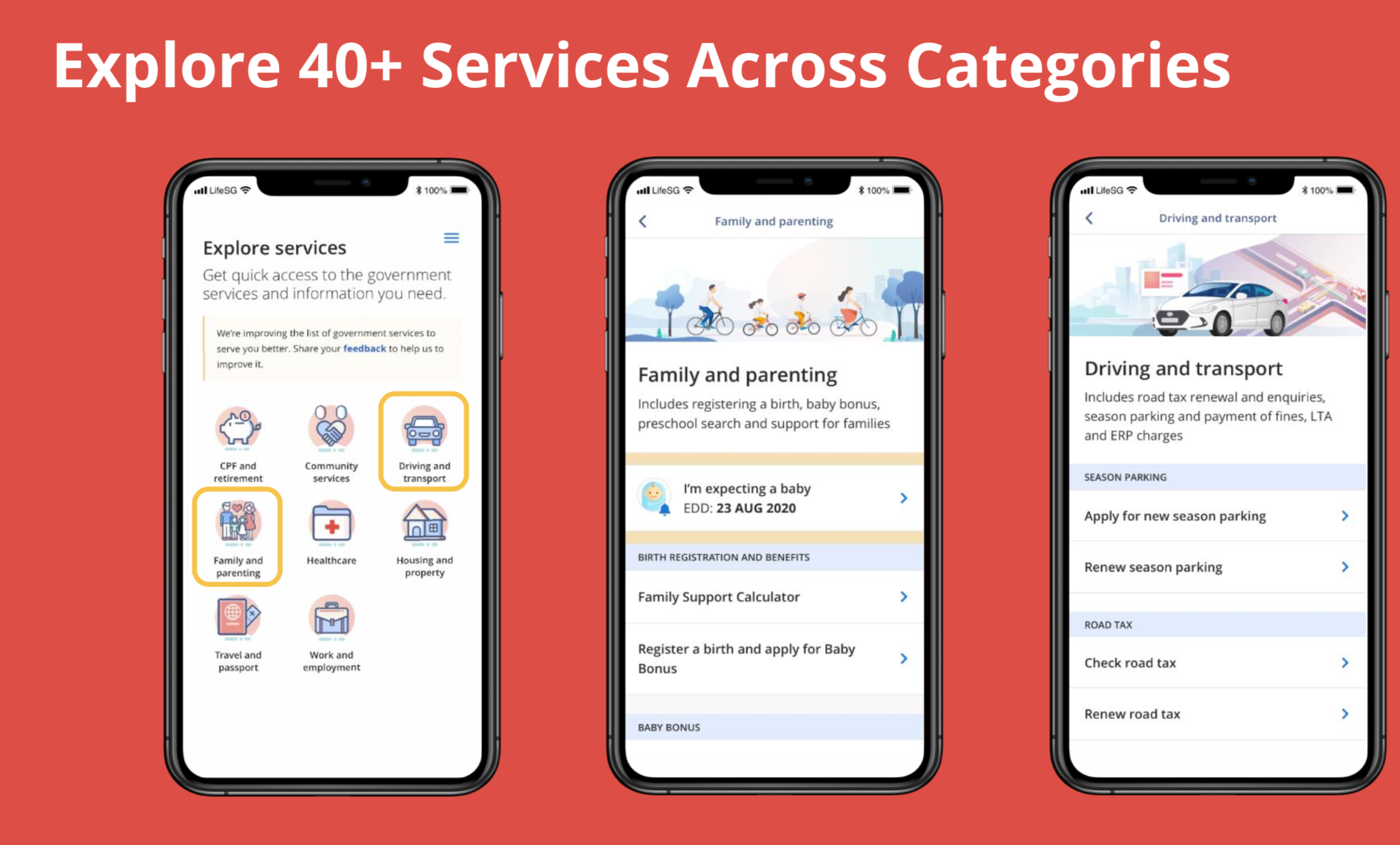
Remember when we said having many different apps could be confusing? So far, LifeSG is bundling more than 40 digital government services in one app – and more are on the way.
Marie Kondo would be proud.
By bundling services based on user needs with large, easy-to-understand icons, citizens can now easily navigate to where they need to be.
Making a CPF Nomination? Easy.
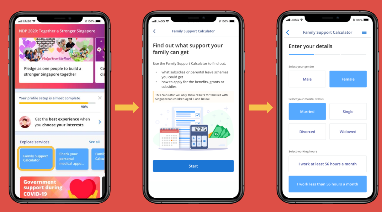
Checking your eligibility for government support grants? No problem.
In the future, we’ll also be continuously adding on relevant services for people of different life stages, whether it’s newly-weds, fresh grads or retirees.
All in a matter of time!
 During the era of COVID-19, it is important to enable citizens to get the help they need in the simplest way possible
Stay tuned – and we’d love to hear from you!
Well, that’s the story for far, but as you know in tech – things are always changing. As tech folks, we’re used to constantly fixing, rewiring, experimenting – and then repeating that all over again.
So here’s how you can help us make the app even better for you:
Try our new app, play with the features and give it a spin. Then let us know what could be better – you can send us your suggestions here.
Because if there’s one thing we’ve learnt, it’s that user feedback is important. And in Singapore – everyone is a user of LifeSG.
Sincerely, The LifeSG development Team
https://www.tech.gov.sg/media/technews/moments-of-life-is-now-lifesg-story-so-far
