How oTTers got into TraceTogether
Love otters and how they’ve become part of Singapore’s landscape? So do we. So much so that users of the latest version of the TraceTogether app, or TT for short, will notice that we’ve incorporated a swimming otter into the display after one does SafeEntry through TT.
Editor’s note: We know that Singapore is stepping down on the use of TraceTogether. But hey, we still love otters =]
Needless to say, the little fellow doing its backstroke has been a hit with netizens. To find out more about the latest iteration of TT, we speak to the design team who brought the otter, together with the other TT enhancements, to our devices.
Ok, the most obivous question first, how do you feel about TraceTogether standing down?
Typically, we want our product to be used by people for as long as possible. But for TraceTogether, it’s unique in that we – the teams working on it – look forward to the day we no longer need these products. Thankfully, that day is here. Trust us, we are really happy we have all made it here with you, our users.
Second most obvious question, of all animals, how did you arrive at featuring a swimming otter? Was it a brainstorming session, was there a vote? Was it close? Were others considered? There’s a tweet suggesting a merlion squirting gallons of water from its mouth, for example.
Actually, the otter has been in TT since mid-2020! But it was more low-key and subtle, like an easter egg. It was meant to bring delight to users, and the development team, ha. We didn’t expect the otter to make it big this time, so we’re surprised and grateful.
We’ve always been thinking about how TT can help to bring warmth and gentle positivity/lightness in these tough times. So where possible, we’ll write and design things in the app to be human and relatable.
The otter made its debut in TT’s group check-in feature for SafeEntry . We wanted to make the experience more human and it made sense to feature one face per family member added to the group check-in. The app won’t be able to know the person’s gender and match an illustration with the right gender. (we could if we asked for the person’s gender. But TT promised to only take data that’s relevant to contact tracing.) So I thought, let’s use animals! They can serve as gender-neutral illustrations that are also warm and relatable.
As for why otters, they are local and cute (though ferocious when eating)! Then I realised the double Ts in otter, so maybe it’s really meant to be TT’s mascot!
Cuteness overload aside, was there any other practical reason for featuring an animated otter at that page?
Well, one big upside is preventing people from using screenshots to enter buildings instead of really checking in.
We started working on this design after the announcement that only vaccinated people can enter shopping malls. The design team took a week to finalise the green pass you see today. But it took us a while to get it out to the public because the team had to make sure there’s coordination between the app and token, with the SafeEntry team, and also take into account any upcoming policy changes from the Health Ministry. This way, we don’t roll out something that becomes irrelevant quickly.
When we were designing the green pass one of our top priorities was to make it easy to tell, from one glance, who’s eligible to enter. From our observations on the ground, the pain point was not just that users had to toggle between screens to check in and then show their vaccination status; it was also that venue staff had to lean in to check the details on TT’s home screen. With the green pass, venue staff can simply look out for the green background and a moving element at the top.
Of course, having an animated otter isn’t a foolproof solution against people determined to cheat the system, but we do what we can within reason and see this as a bonus feature.
The latest version has been a hit but the internet being what it is, there are inevitably some naysayers, such as some who don’t want cute otters to be associated with the TT app. As designers, how do you deal with negative feedback, especially those where there’s really not much you can act on?
As designers, we first get buy-in from the entire product team. Before we roll out a user-facing feature or change, we’ll explain to the team why it’s designed this way, any constraints or trade-offs we decided to make, and hear comments. So usually, the team understands why for example the flow for this feature isn’t ideal.
Of course it’s hard not to feel disheartened when there’s negative feedback. But I’ll still want to read or hear the feedback, because it’s helpful to know the range of ground sentiments about TT.
When I dive deeper into the feedback, I also realise that many of the sentiments are not directed at TT or its design, but more of frustration towards the pandemic or factors out of our control.
We also understand that general users don’t have the full background on the constraints and considerations that went into TT’s design, so it’s important not to take it personally.
As a designer, what’s the nicest feedback and the meanest feedback you’ve ever received?
Haha I’ve heard them all. Usually they go along the lines of “why are the designers/developers so stupid, like that also don’t know how to design, etc etc.” Like I mentioned earlier, sometimes they might not understand the constraints and considerations, so we don’t get too caught up with such comments. But what gets me angry is when people use mean words and tone towards our customer support agents.
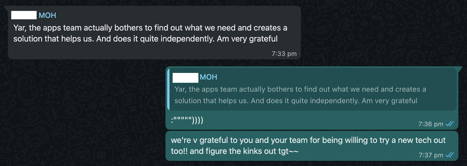
As for the nicest, two come to mind. The first is from the Health Ministry’s contact tracing team affirming that TT is helping them in their efforts.

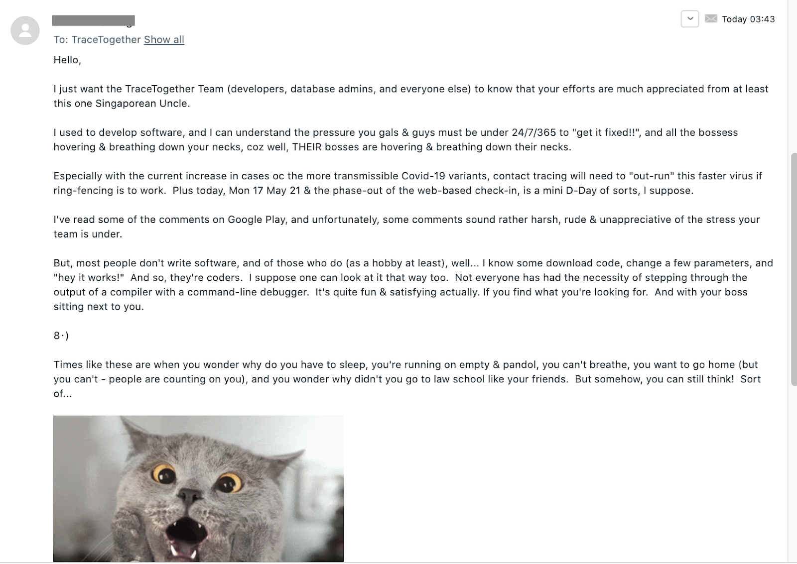
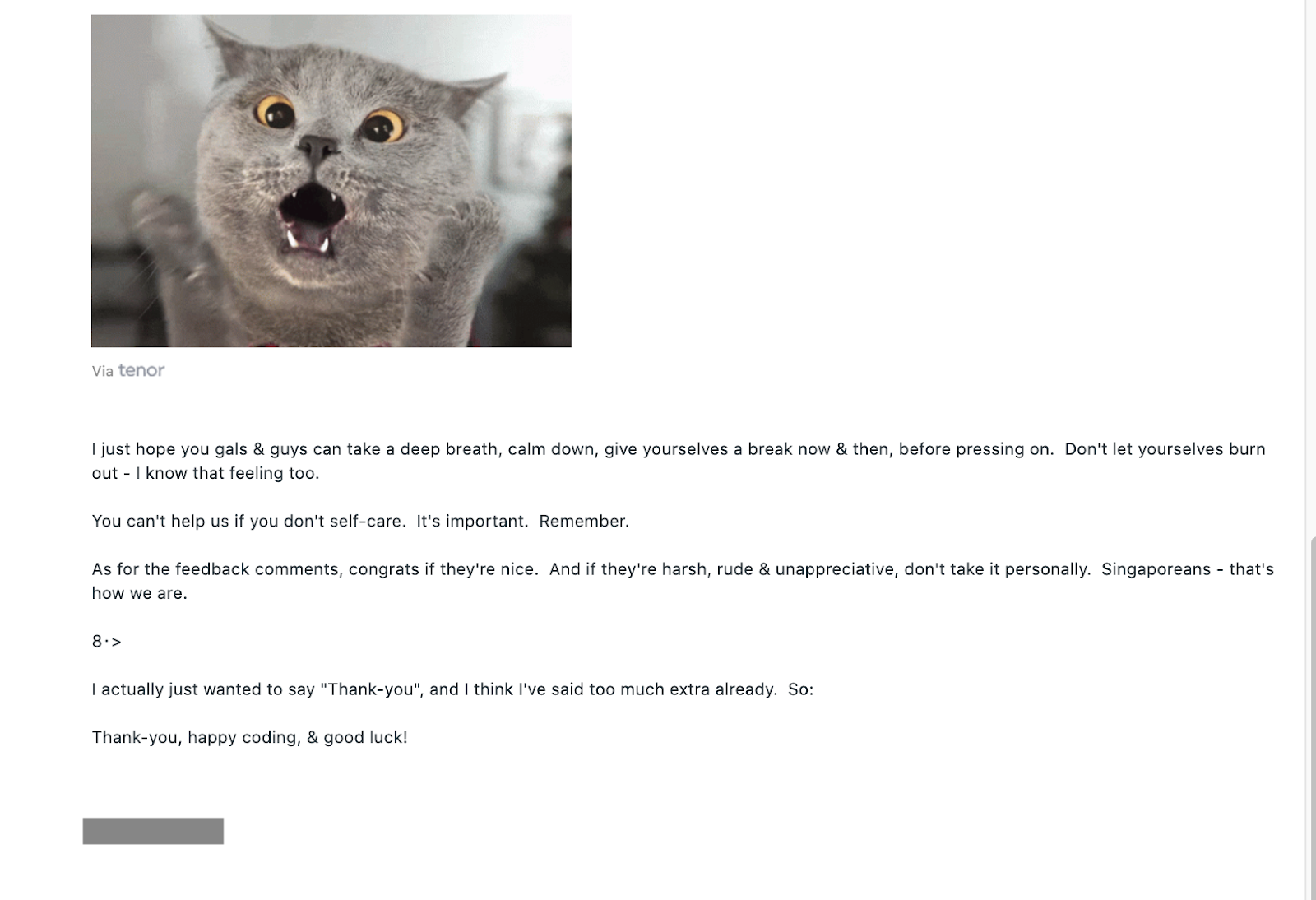
The second is from a super nice Member of Public, who wrote in to thank the team, empathised with our position, sent us a really funny cat gif, and reminded us that we can’t help Singapore if we don’t self-care.


Speaking of feedback, how does the design team gather user feedback and are there any changes that have come about from feedback?
Because of the nature of TT’s work, there were many things that we had to roll out quickly with no time to test. We’ll roll out, pay close attention to feedback from different channels, and then iterate. For features that we can test, we go with the common methods such as arranged or guerilla testing. For the green pass specifically, judging from the number of requests and feedback from the public, it was clear that indicating one’s vaccination status on the check-in pass would be a useful feature. So the design team came up with the design a week after the policy was announced.
The TT app has come a long way, from merely being a bluetooth contact tracing tool to enabling check-ins, and displaying vaccination and test statuses. What was the process like adding more and more features? Did you ever feel – oh no this is gonna screw up my beautiful minimalist design!
It’s challenging and interesting to design for a product where it’s tough to have a clear roadmap. This is unlike the more common approach or best practice where the product and design teams can plan the overall look and feel of the product and decide which parts to build first.
We work as closely as we can with MOH. But because of the rapidly evolving nature of this pandemic, we often have to react fast and go back to fundamentals: What solution (on TT’s end) can be helpful, how important is it, will it have an impact on the things that are already being worked on, does the team have bandwidth, etc.
We usually do what we can with the current user interface, or UI, first. Once we have bandwidth, we’ll shift the UI, ideally bit by bit. Because we cater to a wide range of users, and a huge UI change may confuse our less tech savvy users.
https://www.tech.gov.sg/media/technews/how-otters-got-into-tracetogether
