Data in the time of Cholera

Visualise this: We are generating, gathering and using more data than ever.
Globally, we produce some 2.5 million terabytes of information every single day — 90 percent of which was gathered just within the last two years, according to a 2017 report from IBM Marketing Cloud.
How then, can we ever make sense of such massive amounts of data?
According to Mr William Teo, Visualisation Engineer at the Government Technology Agency of Singapore (GovTech), you can’t — at least not without some data visualisation chops.
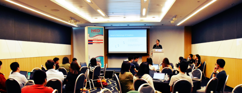
“Numbers do not give us a complete picture. They only provide a summary that is not sufficient for our understanding of the data,” said Mr Teo to the 52 participants of a data visualisation workshop organised by GovTech.
The four-hour workshop, conducted as part of National Engineers Day (NED) 2017, was held at Suntec Singapore on 19 July 2017.
In it, Mr Teo unpacked the concepts and grammar of data visualisation (‘data viz’ to its friends), giving spectacular examples of visuals along the way.
Divining insights from data
What a user really gets from a good visualisation is insight, said Mr Teo.
To understand a dataset in a meaningful and intuitive way, the data needs to be transformed into something that is palatable to the user.
Previously a freelance illustrator, Mr Teo sees data visualisation as a discipline that lies at the intersection of data science, communications and design.
However, while data visualisation certainly has design elements to it, the focus and appeal of a visualisation is not merely in its aesthetics.
“In the data viz world, there’s an ongoing obsession with the process over the outcome,” Mr Teo told the participants.
“But the outcome is not about building a nice visualisation. Instead, it’s about helping someone make a correct or good decision.”
“We want to create a good visualisation that amplifies our cognition, supports our decision-making and enhances our ability to understand the world.”
John Snow and the outbreak of data
Much more than just pretty pictures, data visualisation can serve important practical purposes.
Mr Teo shared a well-known example of this: that of Dr John Snow, an English physician who in 1854 investigated the source of a serious Cholera outbreak in the Soho area of London.
Sceptical of the prevailing view that cholera was spread through ‘bad air’, Dr Snow set about collecting data on the outbreak by speaking to local residents.
His investigations led him to create a data visualisation in the form of a dotmap, which revealed a connection between the locations of Cholera clusters and water pumps.
“Dr Snow plotted the locations of Cholera deaths and water pumps on the map, and used it to support his hypothesis that these wells were the source of the outbreak,” Mr Teo said.
Upon further investigation, it turned out that the water company that supplied the pumps had contaminated them with sewage-polluted river water.
Dr Snow’s study eventually helped convince government officials to take action by disabling the water pumps; after that, the Cholera epidemic gradually subsided.
“When visualising data, you want to support decision-making and analysis, and find patterns within the data. You also want the visualisation to communicate a message, and for it to result in some action.”
What happens in Vega
After learning about the purpose, concepts and grammar of data visualisation, the workshop participants were eager to try it out for themselves.
For the hands-on part of the workshop, the participants used Vega, an open-source web-based tool, to build their own visualisation designs.
The task set by Mr Teo: create visualisations for a dataset consisting of rainfall patterns over several years.
He guided the participants towards creating different types of visuals, each tailored for delivering a specific message.
“To show trends in the rainfall patterns, it’s best to use a line plot because the lines show movement,” said Mr Teo, typing ‘line’ into the Vega editor and setting the visual to a line chart.
“But if you wish to show, say, the average rainfall per month for a specific year, then a bar chart would be more appropriate,” he continued, replacing ‘line’ with ‘bar’ in the editor.
“Vega was very user-friendly and easy to use,” said Ms Grace Hwang, an engineering graduate who now works at the Ministry of Education, adding that she looks forward to applying data visualisation techniques in her work.
Ms Nan Jiayin, a chemical engineering undergraduate at the Nanyang Technological University (NTU), said: “I felt that the workshop was well structured, and I was amazed by the charts that can be produced using data viz techniques.”
By applying their skills to publicly available datasets (Data.gov.sg), budding data visualisation engineers like Ms Hwang and Ms Nan can address the questions that matter to Singaporeans.
Such as, we posit, “When are the best times to hit the gym?” — or “Which is the right school for my child?”
Indeed, with tools such as Vega, one would imagine an outbreak of data visualisation projects, since virtually anyone with a computer and some understanding of the concepts can start creating such visualisations to communicate ideas and answer the tough questions.
Just as the pioneering Dr John Snow once did with ink and paper.
Photo credit:
- Image of Dr John Snow: Creative Commons John Snow by Rsabbattini licensed under CC By 4.0.

