2020’s Data Arcade Tournament: a showcase of visual analytics talents across all government agencies
This year’s Data Arcade Tournament (DAT) has been the largest since its inception in 2018.
Conceived to help public officers get familiarised (and comfortable) with data analytics and visualisation using tools such as Qlik Sense and Tableau, 2020’s event saw 400 teams competing against one another. For reference, last year’s tournament involved just 144 teams.
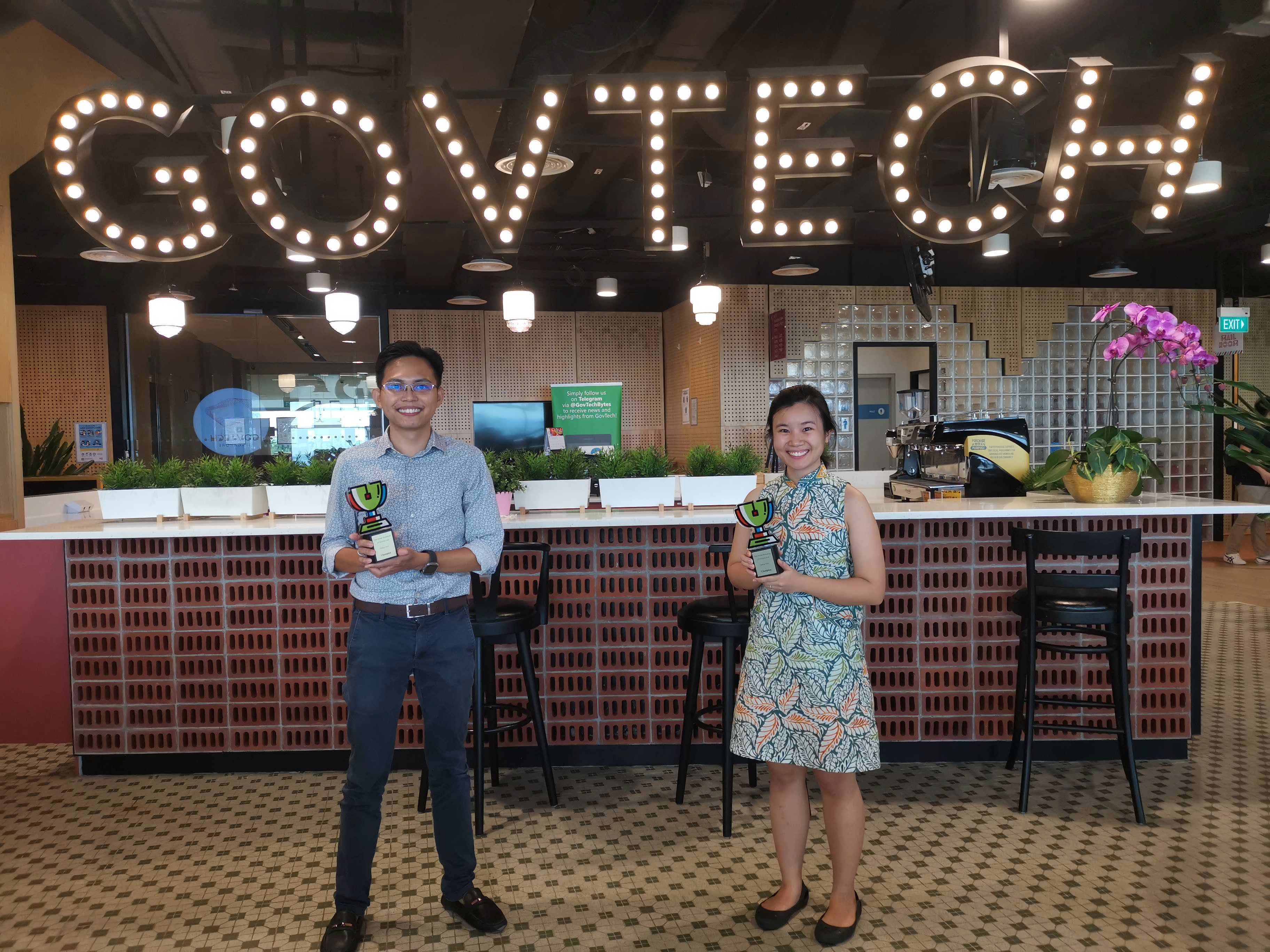
 Team Sample 2 from MOE, Haikal Yeo and Klarissa Khor PHOTO: GOVTECH
The origins of DAT are humble – it was first conceived to help push for upskilling on good visual analytics skills using modern BI (Business Intelligence) tools.
The intentions were two-fold: Firstly, it would help public servants quickly explore complex data and piece together a compelling narrative with good data storytelling. Secondly, it was meant to be a rallying cry across the public service to see data as an enabler – which would lead to stronger data culture within the agency.
Well, it seems like the rallying cry worked.
In 2020, to cater to the increased demand, individual agencies hosted their own runs of the competition for the first time. Teams would first compete within their agency, and the top teams would face off in the last rounds against their counterparts from the rest of government.
Of course, not everyone deals with data on a daily basis. To help level the playing field, workshops were provided for those who were new to visual analytics.
We spoke to Klarissa Khor and Haikal Yeo (both from the Ministry of Education) to find out more about their experience. Their team, Sample Size 2 eventually emerged victorious at the finals under the Tableau Track.
How did you juggle with the involvement in the Data Arcade Tournament amid full work commitments?
Work definitely did not stop even as we participated in the Data Arcade Tournament. We were fortunate to have understanding colleagues, especially during the finals when we were away for two full days. But the preparation leading up to it was usually left to small pockets of time when we were both available, which would usually mean sacrificing a bit of sleep to work at night and over the weekends.
What was the most challenging part of the live hackathon, and why?
The sheer amount of data took us by surprise. We had certain ideas in mind which worked on the sample data set, but when it was a million lines or so, we could only execute about 75% of our game plan, especially since our computers did not have enough processing power to plough through the data quickly. It also makes very stark which methods would work with such a large data set, as only the most efficient ones were capable of giving us the results we wanted in a reasonable amount of time.
Did having a community of fellow participants, support from the organising team and dedicated mentors help? In what way?
Definitely. MOE x DAT 2020 team supported us with Tableau Doctor sessions and we attended more than one session as we had quite a number of queries on certain functionalities we were exploring and were unsure whether it was even doable. The sessions enlightened us to think about possible workarounds, and that opened up a lot of possibilities when thinking of alternatives.
Our mentor from Tableau was also very helpful and pointed us to many resources that showed us lots of data visualisation charts which are quite different from the typical ones, and very aesthetically pleasing. For example, our mentor suggested for us to use small multiple charts and it was very helpful to slice the data in so many different ways and analyse them all at once.
What did you find most enjoyable about the Data Arcade Tournament?
Data story-telling was the most enjoyable part of the whole process. Having the data in front of you is one thing but stringing it all together in one coherent narrative in a way that sticks with the audience is another.
It was also very satisfying to hear that some of our friends have been actively using our original submission on P1 places and property prices for their own planning purposes.
If somebody is thinking of going for the Data Arcade Tournament next year, what would you say to them?
Just give it a go.
Get your hands dirty, feel a little stuck – that’s all part of the process. There is some unspoken satisfaction when you have an idea in your head and manage to put together into a dashboard.
At the end of the exploration process, be unafraid to strike out some ideas as you sharpen the focus of your dashboard. It is better to be focused than have too many cluttered ideas with no clear direction!
Beyond the tournament, do you have any plans on developing your visualisation skills or perhaps share your experience with your peers?
We plan to continue keeping up with our skills in Tableau and hope that we can incorporate Tableau into our existing work, to visualise data in a way that is interactive and where quick insights can be derived.
Top tips from the MINDEF teams under the Qlik Track!
 Comms Data Science Team, Rebecca Loo, Michelle Lee and Zeng Yukai PHOTO: GOVTECH
The top teams under the Qlik Track of the tournament also shared their experience and gave some quick tips for public officers who are keen to participate in the tournament for the year 2021.
Ng Wan Ling: It’s important to frame your story from the onset. Come up with a broad storyline to scope your analysis, make the assumptions and set the hypotheses before you dive right into the visualisation of the datasets. That will create a dashboard that is easier to comprehend and use.
Rebecca Loo: Our team prepared plenty ofdata scripts and a few template dashboards beforehand as reference and that definitely eased our stress during the five hour live hackathon. We cannot emphasise enough the importance of early preparation!
Michelle Lee: Ask whenever possible! There were many functions of Qlik we weren’t aware of, but by asking our mentors from Qlik, we managed to bridge those knowledge gaps, and this benefitted our end result immensely. Asking others, especially experts, usually provides a different perspective that leads us closer to the ideal destination.
https://www.tech.gov.sg/media/technews/data-arcade-2020
